Fundamentals

So, the other day a post popped up in my Facebook feed touting a design contest for Buncombe County (the next county over) and their “I Voted” stickers for the upcoming election in November.

“Must say ‘I voted.’ … the rest is up to you … deadline September 2 … designs voted on September 7-22 …  winner announced September 22.”

Excellent! So, I got to work and banged out a design that I was pretty happy with, only to REALLY read the instructions after the fact.

“WHO: Any young person, ages 13-18 that is a resident of Buncombe County is eligible to participate.”

Dammit. I am neither ages 13-18 nor a resident of Buncombe County.

[Insert facepalm emoji here.]

Reading. It’s fundamental.

Wasted Energy

Fundamentals

Flashback Friday [Logo Edition]

Earlier this year, I ran across a social media post (probably on Facebook) that was talking about Kids Place (an organization that helps abused children) a few towns over. The photo attached to the post immediately caught my attention. Something on the printed brochures in the picture looked really familiar.

Kid's Place

30 years ago when I was in school for graphic design, the class would occasionally be assigned projects to design brochures, letterheads, business cards, logos, etc. for local organizations. Kids Place was one such organization. Everybody in the class was tasked with designing a 2-color logo for them. The winner would then use their logo and design up letterhead and business cards. Well, I was the winner. I designed up the requested materials and received printed samples which I then mounted on mat board to put in my portfolio. And that was the last I thought of Kids Place and the work I did for them because it was a class project.

So, imagine my surprise when I ran across the above photo and the logo on those brochures looked VERY familiar. I even checked to see if the logo was on their website and it was. Needing answers, I dug my old portfolio out of the closet and confirmed my suspicion. They ARE still using that logo I did all those years ago when I was 19 or 20 and everything had to be done by hand. This was just before computers and Aldus Pagemaker (this was before Adobe purchased the program from Aldus) made things so much easier.

My Kid's Place Logo Printed Sample

Honestly, I find this logo to be pretty cringe-worthy now. But, I guess we all think that about things we did many years ago when we were young and inexperienced. I am totally surprised (and maybe even a little flattered) that they are still using it after all these years. Crazy how some things come back at you years and years later.


Flashback Friday [Logo Edition]

Rockin’ the “D”

Wow. Life and my brain chemistry sure are trying their best to knock me down. But, I am still here. Sorta.

We braved the COVID infected crowds and went to Gatlinburg for the day this past Saturday. It had been well over a year since we had been … and the lure of moonshine and getting the fuck out of the house proved to be too great to resist. We sampled moonshine and hard cider, plus had a disappointing lunch at our favorite place to eat.

Moonshine!
Sweet, sweet ‘shine! (And yeah … I need a beard trim.)

Mysterious Mansion ... Closed!
Besides the disappointing lunch, the worst part of the day was that the Mysterious Mansion didn’t open until 5:00 pm. This picture was taken at 2:00 pm. There were a fuck ton of people on the street and in stores with absolutely NO safety precautions in mind. So, we didn’t want to hang around and kill three hours until they opened. Maybe next time, Mysterious Mansion!

And now there will be 10-14 days of paranoia about whether we both got infected while in Gatlinburg. Was it worth going? I guess time will tell.

Meanwhile …

I am one week away from hitting the big 5-0! On Sunday, my friends threw a fun little surprise party. It was really great to see the selection of friends that showed up. It feels like it’s been ages since I have seen that many people I know in one place at one time. Food. Fun. Fellowship. It was a really nice afternoon.

Surprise Party Cake!
Honestly, it feels like the slide started years ago.

Happy Dance
And, this is what it looks like when you open a box and there are books that you wanted inside. Books make the best presents! Well … books and Blu-rays and records and CD’s. Ha, ha.

#25 Trainspotting from Coattail Publishing
And, what do you do when you are nearing 50? Why, you pre-order an insanely expensive, oversized, limited edition coffee table about the making of one of your favorite films. To be honest, it’s not the book that’s insanely expensive … it’s the shipping from the UK that is. #25 Trainspotting looks like it’s going to be really awesome! The same author and company are working on a book about Taxi Driver which I am fairly certain I will end up ordering as well. Yay, books about movies!

Rockin’ the “D”

A Post [Finally Edition]

Talk about feeling down and out and unfocused. I am in a funk (!) … but somehow managing to make it through. That is until my bank account gets depleted from all my “I am depressed and gonna buy things to cheer me up” purchases.

Meanwhile, here are some recent happenings.

Drugged Up Dog
Chip went in for a full mouth extraction two weeks ago. Yeah. Poor little guy no longer has teeth. This picture was taken when first we got him home. He looks so cute in his all-drugged-up state. He didn’t look so cute a few hours later when he was drooling blood everywhere. The first few days of his recovery were stressful but he bounced back pretty quickly considering his age and the fact they pulled 19 teeth. It really is for the best. His teeth were so bad that his jawbone had started to rot as well. So no more teeth for Chip and (more importantly) no more death breath for us to smell!

Sleepy Toothless Pup
And here’s an adorable picture of a pup and his favorite dad the night of the surgery. They slept like that for quite a while as I giggled my way through Ferris Bueller’s Day Off (a great stress reliever of a movie).

Jon and Carrie!
Jon and Carrie (and their kids) came into the area to visit! They have been in Colorado for quite a few years now. So, it’s always great to get to see them.

Cold Creek Flood Damage
A little over three weeks ago, the remnants of Hurricane Fred caused catastrophic flooding in the county. The Cruso area and the town of Canton were again hard hit. The pictures above are of Cold Creek Road where my sister lives. Fortunately, her house did not get flooded … but it did damage the bridge onto her property (seen in the top photo). The scary thing about these photos is that this small creek became a monster that destroyed a two-lane road. Yeah. There used to be a road where that new streambed is. Unfortunately, five people were killed in the flooding, and scores of people have lost their homes. This week a major disaster declaration finally came down from the federal government. I am hoping the community can recover quickly. Nature is awesome and totally terrifying.

[title of show]
Finally seen out in the wild is the logo design I did for Asheville Community Theatre’s Graphic Design Project. Yay!

Now … bring on FRIDAY and the WEEKEND!

A Post [Finally Edition]

Gotta Get Back in the Groove … [Redux]

Sheesh. It’s been over three weeks since my last post.

I know this is directly tied to the wild mood swings I have been dealing with all year. Happy. Sad. Happy. Depressed to the Point of Stepping into Oncoming Traffic. It’s been a fun month.

I did finally get off my lazy ass and get the ceiling in the bathroom painted. Trust me. It REALLY needed it. Now it doesn’t look like a crack den in there.Newly Painted Bathroom Ceiling

The newest addition to my vinyl listening arsenal is an Audio-Technica Disc Stabilizer. An annoying amount of new records have been showing up dished (or bowled as it’s also referred to). So, I got this to ease my worry or ruining my stylus or damaging the grooves on the record.Audio-Technica Disc Stabilizer

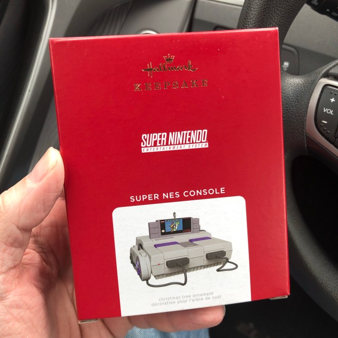
And, I am excited to have snagged a Super NES Console Ornament from the local Hallmark store. I was there the first day this ornament was on sale (July 11) and managed to buy the last one. Good thing as it appears to be sold out online now as well. Super NES Console Ornament

A couple of weeks ago, David and I went to see the first big post-COVID shutdown show at the theater. We kinda had to go because we are good friends with the director and know several people who were performing in it. I haven’t been to the theater since I turned my keys in last July and have had nonexistent contact with any of the staff there since then. Combine that with the major slight last month, which meant that I really DID NOT WANT TO GO. I was so wound up about being there that I almost had an anxiety attack at the top of the show. Ugh. And, I ended up talking to and playing nice with the one person I did not want to see after the show. Triple Ugh.

Needless to say, when we got home, I couldn’t stop myself from pouring over the program with my red pen looking for any design problems or errors. What I wasn’t expecting was the sheer number of typos, grammatical issues, and stylistic inconsistencies I found … which means NOBODY proofread the damn thing before it was printed.
Proof Reading is Fundamental

For the record, it can be hard to go to sleep when you have a dog straddling your torso.
Tough to Sleep

This week sees the wrap-up of Asheville Community Theatre’s Graphic Design Project. I have been plugging away at design ideas for [title of show] and have narrowed it down to three different logo treatments. I am dead curious to see which one will win the race. Hopefully, I will know when we meet up Thursday night to present our designs.

Gotta Get Back in the Groove … [Redux]

Meanwhile

Several weeks ago, I submitted an entry in Asheville Community Theatre’s Graphic Design Project. They were looking for four graphic designers to do logo treatments for each show of their upcoming 2020-2021 season. The season consists of Clue, Fight Girl Battle World, The Giver, and [title of show]. I found out last week that I was selected as one of the four and had our first meeting this past Tuesday. Exciting! The point person assigned a show to each designer and I ended up with [title of show]. This show and Clue are going to be the hardest to work on as both already have very recognizable logos that get used pretty much anytime these shows are staged. [title of show] also has the added handicap of being stylized by being done in all lowercase letters that are enclosed in brackets.

Anyhoo. I am super excited to be working on this! Hopefully, I can come up with something suitably graphic and slightly different from what’s been done before.

Here’s the group of happy designers after our first meeting …

ACT 2021-2022 Designers

In a sure sign that my brain is totally fucked up, I have spent the last two nights having dreams about buying or losing out on buying the Record Store Day 2021 release of Garbage’s No Gods No Masters that was released on June 12th. It has a variant cover (different coloring) and vinyl color (translucent pink) and was limited to 2,700 units. Needless to say, I took this as a sign and found a copy online this morning, and ordered it. I mean … it’s not like I have this on neon green vinyl and deluxe CD already. Sheesh.

Meanwhile

Defeated

Out of the 17 designs I submitted to the client (all of which could have been used for this project), only ONE was approved for printing. Now I feel like a no-talent piece of shit who should just go flip burgers at McDonald’s.

Defeated

Eye & Ear Candy [Dark Edition]

Finally finishing up Dark on Netflix and I gotta give a shout out to the main title designers (ARRI Media VFX and Lutz Lemke). I am a sucker for a great title sequence and I gotta say that Dark has one of my favorites. And, yes. I quietly judge people who skip title sequences.

Ben Frost has composed some wonderfully ominous music for the show … which you can sample below and purchase here.

Dark also has an insanely great music supervisor (Lynn Fainchtein). I know I am not alone in wanting an official of a complete series soundtrack of songs used in the show.

Here’s the full version of Apparat‘s “Goodbye” which is used for the main titles.

Eye & Ear Candy [Dark Edition]

Designer Blues

A few months ago I got asked by an acquaintance to design some artwork for a production he is directing of Three Tall Women. I put together something I thought was beautiful, elegant and really captured the feel of the show.

Here’s the original art …
Three Tall Women

So, imagine my annoyance when he posted this image to Facebook the other day. It seems like the theater that is presenting the show took my art and added some branding and dates. Notice anything wrong?
Three Tall Women Butchered

They used a chunky, bold, serif font (for the branding and dates) that doesn’t match the look of the art at all. Gross. But most egregious is the fact that they cropped the art and then stretched it vertically. Ugh.
Three Tall Women How It Was Butchered

This isn’t the first time I have had something I designed changed for the worse by another person. So, I guess I shouldn’t be so sensitive. It’s just super annoying to see something you spent your time and energy on getting butchered like this …. especially when I would have added this information in a tasteful way had someone only asked me. Needless to say, I will have to think long and hard before I do art for this person or organization again.

Grrrrrrrrr.

[Okay … Rant Finished]

Designer Blues

Survivin’ It

So, yeah … the first Christmas after Dad died. Survived it. My step-mother decided to still have the annual Christmas Eve Breakfast for Dinner Gathering. The familiarity of it was nice but sad at the same time without Dad running around handing out presents to everyone. Nobody got weepy which was good. I saved that for a few of days later.

I was in Walmart on Friday evening and walked past a guy who was wearing a uniform from the place my dad managed right up until he got too sick to work. Dad generally wasn’t seen out of his work shirt the last few years. The loss and sadness really hit me. I managed to make it out of the store and back to the car before breaking down and creating a scene.

Saturday we tripped over the Gatlinburg with Graham and Kristen for moonshine and an escape room adventure. The usual places were visited … Ole Smoky, Sugarlands, and Doc Collier.

Big Maw Bertha’s Fussin’ & A’ Feudin’ Moonshine Hill Hootenanny
Graham and Kristen are big into escape rooms and wanted to check out MOONSHINE HILL HOOTENANNY at Gatlin’s Escape Games. The room was fun and way more high tech than I thought it would be. I felt like we overthought some of the puzzles and that got us behind time with only one hour to break into Maw’s shack, sabotage her moonshine recipe, and blow her ‘shine still to smithereens. SPOILERS: We failed (and found out that Kristen’s desire to win is both awesome and a little scary). But it was fun and I am looking forward to trying another escape room sometime soon.

And yesterday, I was bummed to read about the passing of Vaughan Oliver, mastermind designer of some the most iconic album sleeves of the 80’s and 90’s. He provided the visuals that went right along side of some of my favorite albums of the era (most notably for me are Cocteau Twins’ Treasure, The Pixies’ Surfer Rosa and Doolittle, and The Breeders’ Last Splash).

Vaughan Oliver

Survivin’ It

Tidbits

Yeah. I am alive … somewhat.

I have had a freelance induced stress headache since last night … but it appears that the most stressful of projects is finally out of my hair and at the printers.

Sometimes the stress outweighs the money. So, I am going to have to think long and hard about whether to put myself through this particular project next year.

This is funny and somewhat true …
Resignation

Meanwhile, here some other things that have happened.

Good Friends
I got take a night off and see Michelle while she was in town. It’s always awesome to see this truly special person.

Stranger Things 3
Binged Stranger Things 3. It was thrilling, funny, soul crushing, and oh-so 80’s. I loved it.

Hazelwood Farmacy
Went and had a burger and a milkshake at the Hazelwood Farmacy with A&A. Yeah. That burger is slathered in Pimento cheese. Yummy. And the mint chocolate chip shake was also tasty as fuck.

SPIDER-MAN: ™ FAR FROM HOME
And caught Spider-man: Far From Home. The movies itself is fun, fun, fun. It’s just too bad that Jake Gyllenhaal didn’t get an obligatory shirtless scene like Tom Holland did. Bummer.

AND! I am not sure how I missed hearing this Pet Shop Boys/Jean-Michel Jarre collaboration from three years ago. I guess that means I am not as good a PSB fan as I thought I was.

Tidbits

Bad Design [Batman Edition]

The original four Batman movies are coming to the 4K UHD format. Exciting!

And, the art for the covers? Terrible!

It looks like the design decisions were turned over to a 19-year-old intern that didn’t give a shit. Ugh. C’mon, guys. There are plenty of talented graphics designers out there that would love to take a crack at something like this … and would do a much better job.

Bad Design [Batman Edition]